|
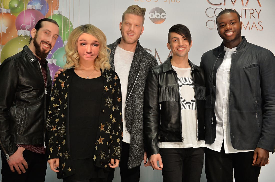
Here is my put yourself on someone elses face project. Here I replaced Kirsten Malconado's face with mine. It took awhile because I didnt have a proper photo of myself to edit. I tried the hardest I could and at the end I put a filter over the whole photo to blend some colors more. I used alot of the smudge tool to try and get my skin tone to match hers and I think at the end I did a pretty good job at achiving so. At the end of the project I learned I needed a big photo in order for the proper photo to work as a product. I also learned how to properly select and move an item from one photo to another, since I have struggled with that before.
-------------------------------------------------------------------------------- |
|
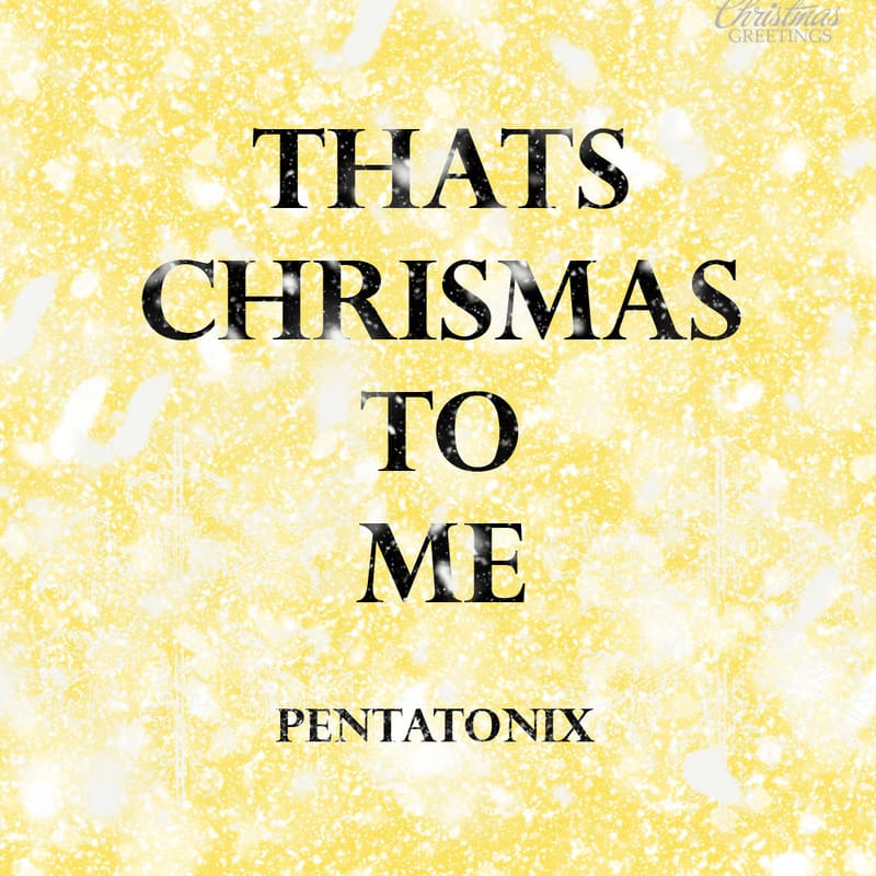
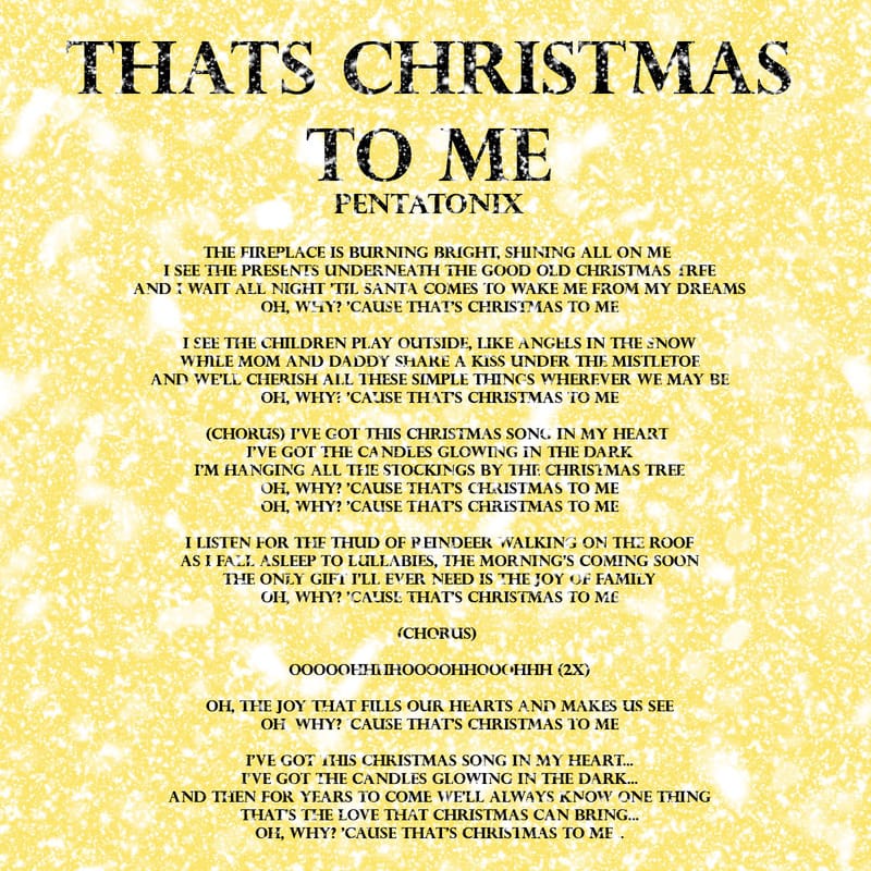
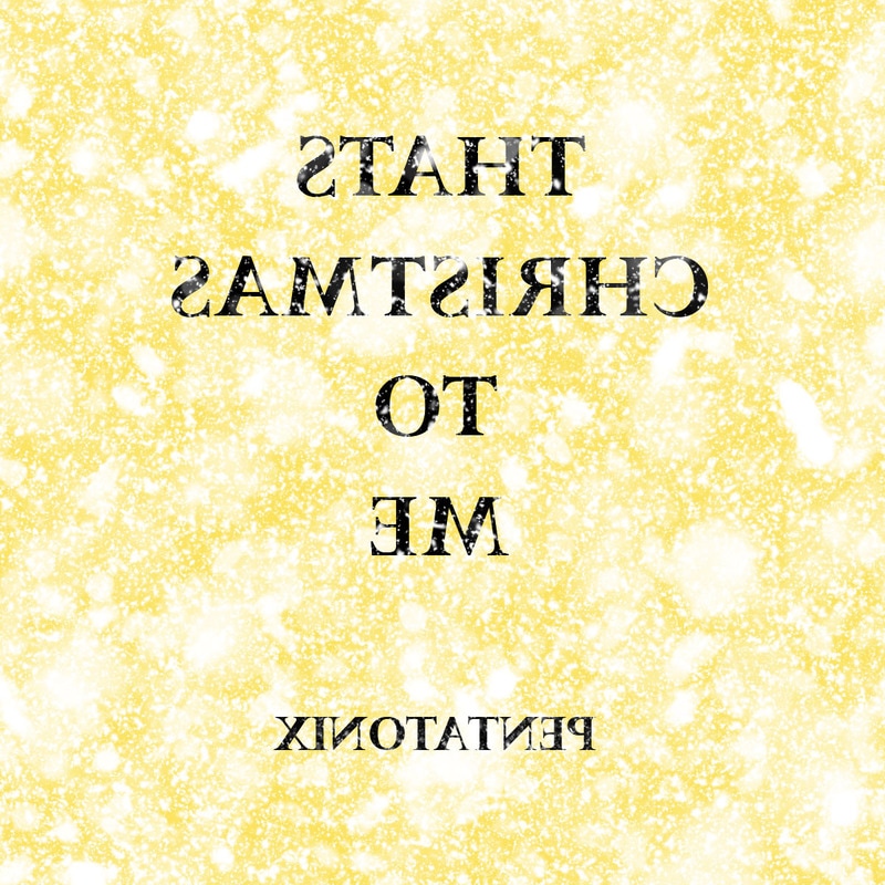
Here I have my first album cover for Penatonix's "THATS CHRISTMAS TO ME" which is labeled in the center in large letters. Underneath I have in smalled letters "Pentatonix". The background color is a golden yellow, I downloaded stamps of snow and decorated the background as such. I also did that on the back as well. On the back I also put the title and the band name as well as all the lyrics for the song in size 14 font.
UPDATE---- I KNOW I SPELLED CHRISTMAS WRONG!!! --------------------------------------------------------------------------------------------------------------- |
|
I love this song mostly because it shows the true meaning of christmas, friends and family, and magic and beliefs of children. It shows the old memories each of the band members had and how they look back at them with joy, not grief, because it is Christmas. I learned in this project, how to download stamps and make more than one text box in one picture. That will help me plenty in the future.
--------------------------------------------------------------------------------------------------------------- |
|
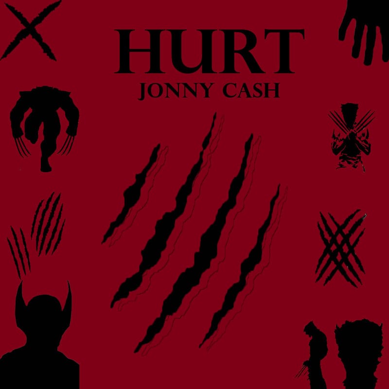
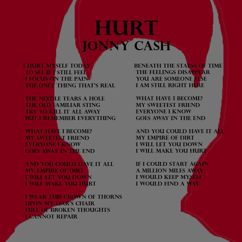
Here is my 2nd assigned album cover with the title "HURT/ JONNY CASH" written at the top middle. I was told I had to put at least 10 pictures to effortly show what I thought the song meant. I chose all of these because of the new movie coming out soon called "LOGAN" that I heard will be an amazing movie. This song was in the trailer of said movie and thats how I got inspiration for the scratches and the sillouettes of wolverine.
-------------------------------------------------------------------------------- |
|
The back of this album shows the title as well as the singer "HURT/ JONNY CASH" writen at the top middle like the cover. I also wrote the lyrics from the song on the back side. I have also a gray sillouette of wolverine behind the text, which was very hard because I had to make it super light to make the text visible. This makes it pop more but you can also focus on the words. I did forget the logo design on the back of this design but overall in very happy with the outcome. What I learned the most was patience and trail and error. On the front side I kept on getting frustrated because I couldnt find good quality photos to make as a sillouette, and on the backside the sillouette was too dark so it took attention away from the very detailistic words. Overall I need to work harder and be more aware of what I am doing while working.
--------------------------------------------------------------------------------------------------------------- I decided to use the first album cover I did in this class. I had to merge all of my layers to one and flip the cover horizontally to transfer correctly on the tshirt. I then printed the photo on a jpeg and put on Microsoft Publisher. I printed the Photo on a specific type of transfer paper for the Tshirt making. After that I went to the Tshirt press and Mr. Adams transfered my album cover onto the shirt. I learned that there can not be a single crease in the shirt when pressing the photo into the fabric. I also learned you should be very careful with hair and lint on the shirt because they can become permenant underneath the photo. Also any white color on the image will not show up on the tshirt if it is white as well, only if the shirt is a different color. |
