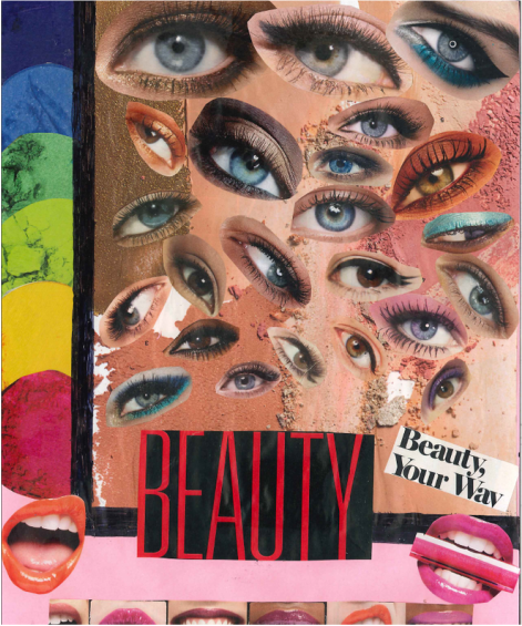
What are we looking at? Here we have multiple eye shapes all over the page, different sizes and colors show the audience that you can do makeup the way you want, "Beauty Your Way". The big bold letters of "BEAUTY" is shown in the lower middle of the ad, grabbing the viewers attention showing them what the ad is about. A black, bold border shows the element of line. To the left of the line is 6 different shades of pigments of makeup. On the bottom of this ad it shows different skin tones with different shades of lip colors, with different shaped lips. The elements I focused on the most in this project are color, line and shape. The principals I used are balance, and emphasis.
What did I learn? During this project I learned that color and emphasis grab the attention of the viewers a lot. That without line and balance and the other principals/elements, ads would be bland and boring and not popping out like they do now. I also learned how to organize magazine clippings in order of size and color coding. color is one of the biggest elements that help emphasize
What did I learn? During this project I learned that color and emphasis grab the attention of the viewers a lot. That without line and balance and the other principals/elements, ads would be bland and boring and not popping out like they do now. I also learned how to organize magazine clippings in order of size and color coding. color is one of the biggest elements that help emphasize
|
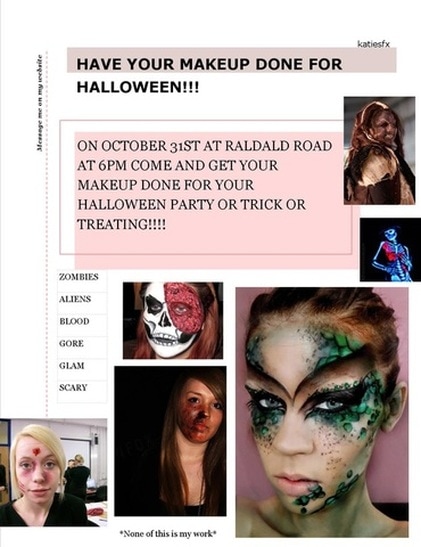
Here is my first flier of the three that we were assigned. for the first flier I used a template given to me via Google Publisher. my flier is pink and has the words "HAVE YOUR MAKEUP DONE FOR HALLOWEEN!!!" as the title. along the side behind the dotted lines I have "message me on my website" for more information. in a pink box I have the words "On October 31st at Raldald Road/at 6pm come and get your/ makeup done for your/Halloween party or trick or/treating!!!!". after that I have a list of makeup styles I love to do on other people including, but not limited to " zombies/aliens/blood/gore/glam/scary". I also have multiple pictures around the flier that I did not do. none of those makeup looks are mine or my idea. all pictures were taken from clip art. the elements of design I prioritized for this flier is line, and size. the principles I used were balance, and emphasis.
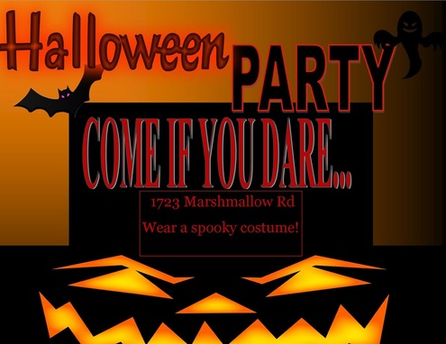
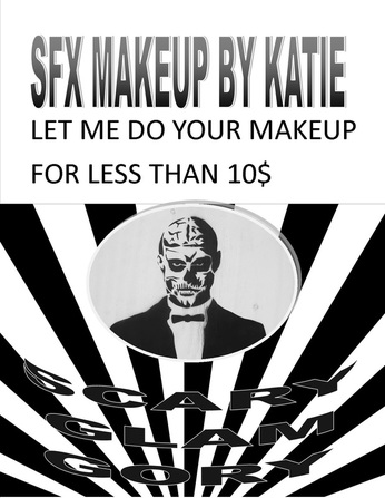
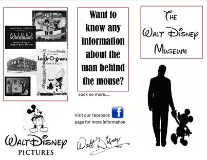
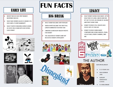
-------------------------------------------------------------------------------------------- Here I have my second flier for a "Halloween Party" which is in big letters on the top of the page. my second flier is in landscape form. I have a black colored bat with purple eyes, and a ghost, of the same color, on the other side of the page. underneath I have in big red letters "COME IF YOU DARE...". underneath that I have in a thin red box " 1723 Marshmallow Rd/ Wear a spooky costume!". at the very end of the page I have a very scary pumpkin staring at the reader. the elements I focused on in this flier is line and color. the principle I used the most was emphasis. --------------------------------------------------------------------------------------------- This is my third flier for my SFX makeup. with the title of "SFX MAKEUP BY KATIE" at the top, you can totally see what I am promoting. underneath the title I have the subtitle "LET ME DO YOUR MAKEUP/ FOR LESS THAN 10$". I have a cool background of black and white lines, and a circular picture of a man in skeleton makeup. I have, in black and white words "SCARY/GLAM/GORY" along the bottom in a curve fasion. because of this assignment I couldn't focus on color, yet, I did focus on different shades of black and white, and I focused a lot on emphasis. --------------------------------------------------------------------------------------------- For the brochure assignment I used the topic of my "own" Walt Disney Museum with that as the title. I then added a picture of Walt Disney and his bud Mickey Mouse right underneath it. when you open the brochure I have the title Fun Facts at the top. I have 3 subtitles underneath named EARLY LIFE, BIG BREAK, and LEGACY, referring to the master himself, Walt Disney. I then list the accomplishments underneath each subtitle and add pictures to add to the effect. when you close the brochure --------------------------------------------------------------------------------------------- |
|
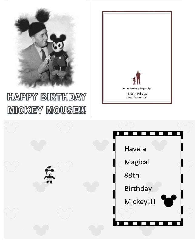
Here I have my birthday card from the one and only Walt Disney to his beloved mouse Mickey. On the cover i have "HAPPY BIRTHDAY MICKEY MOUSE!!!" in big bold letters at the bottom. Then above that i have a picture of Mickey and Walt Disney with mickey mouse ears. the picture is outlined with squiggles made by the smudge tool. i used a filter to make it black and white to look older. on the back of the card i have a red outline. at the bottom 1/3 of the paper i have a silloute of Mickey and Walt Disney in the same color as the outline. in the inside of the card i have a small mickey mouse plushie n the inside with a background picture. on the right i have a rectangle border with "HAVE A MAGICAL 88TH BIRTHDAY MICKEY!!!" written in the middle with a mickey symbol on the right.
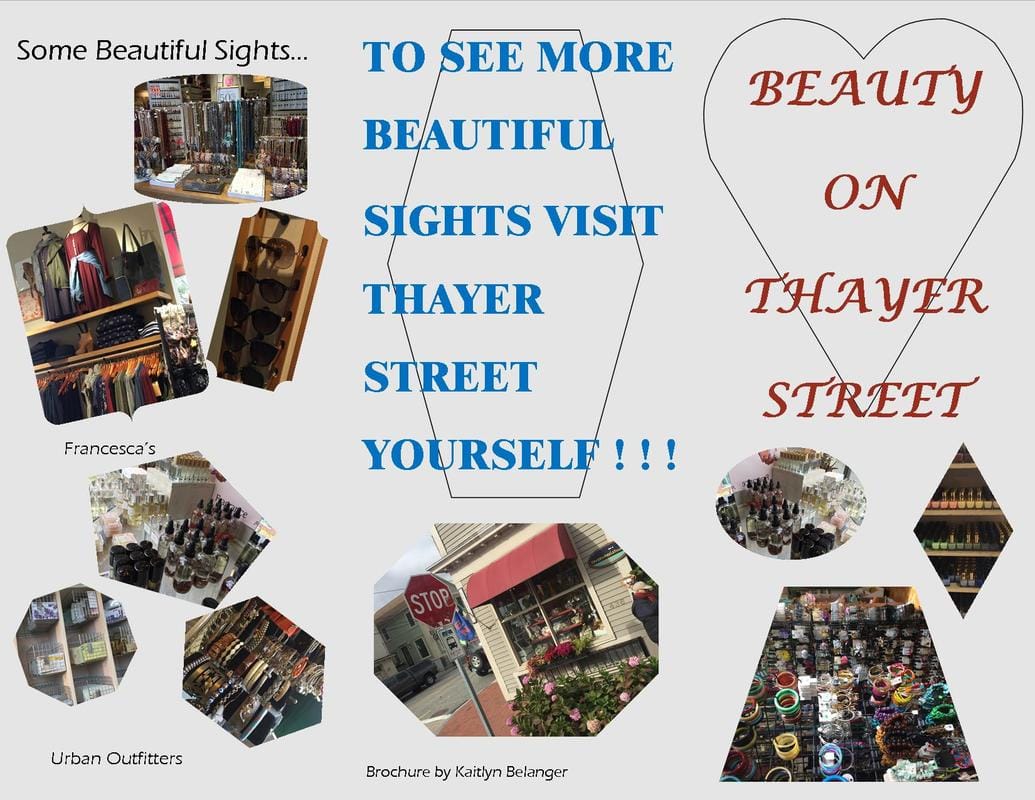
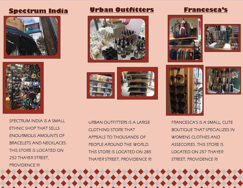
-------------------------------------------------------------------------------- Here is my "BEAUTY ON THAYER STREET" brochure with a heart surrounding the title. i have then 3 pictures from around the treet. one in a circle, another in a rectangle, then a trapazoid. on the inside flap there are 6 different pictures in different shapes from different areas on thayer street. on the inside i have 3 specific stores and 2 or more pictures for each. also have a brief discription of each store underneath including what they speialize in, where they are, and what kind of people normally shop there. all items on this page follows the same color sceme with a cute rhombus design at the bottom. at the very back of the brochure i have "TO SEE MORE BEAUTIFUL SIGHTS VISIT THAYER STREET YOURSELF!!!" written in bold, with a stretched out hexagon underneath. i then have an octogon picture outside of thayer street. while doing this project i learned how to properly make a collage as well as organizing pictures to appeal a specific target audience. |
